

My role: UI and UX Designer
Team: Digital Strategist, Business analyst Developer & Test analyst
Tools: Figma
Duration: August 2021 - November 2021
Team: Digital Strategist, Business analyst Developer & Test analyst
Tools: Figma
Duration: August 2021 - November 2021
Overview
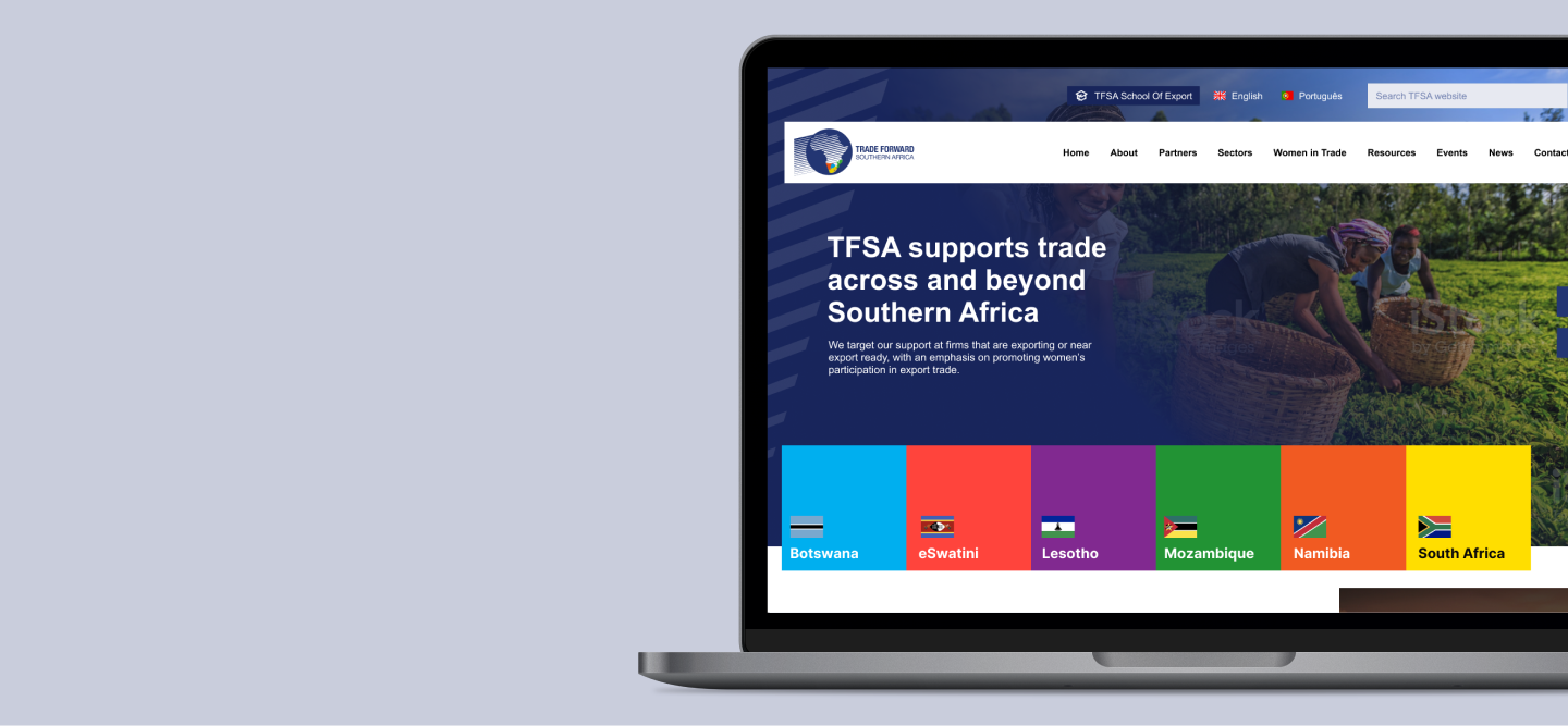
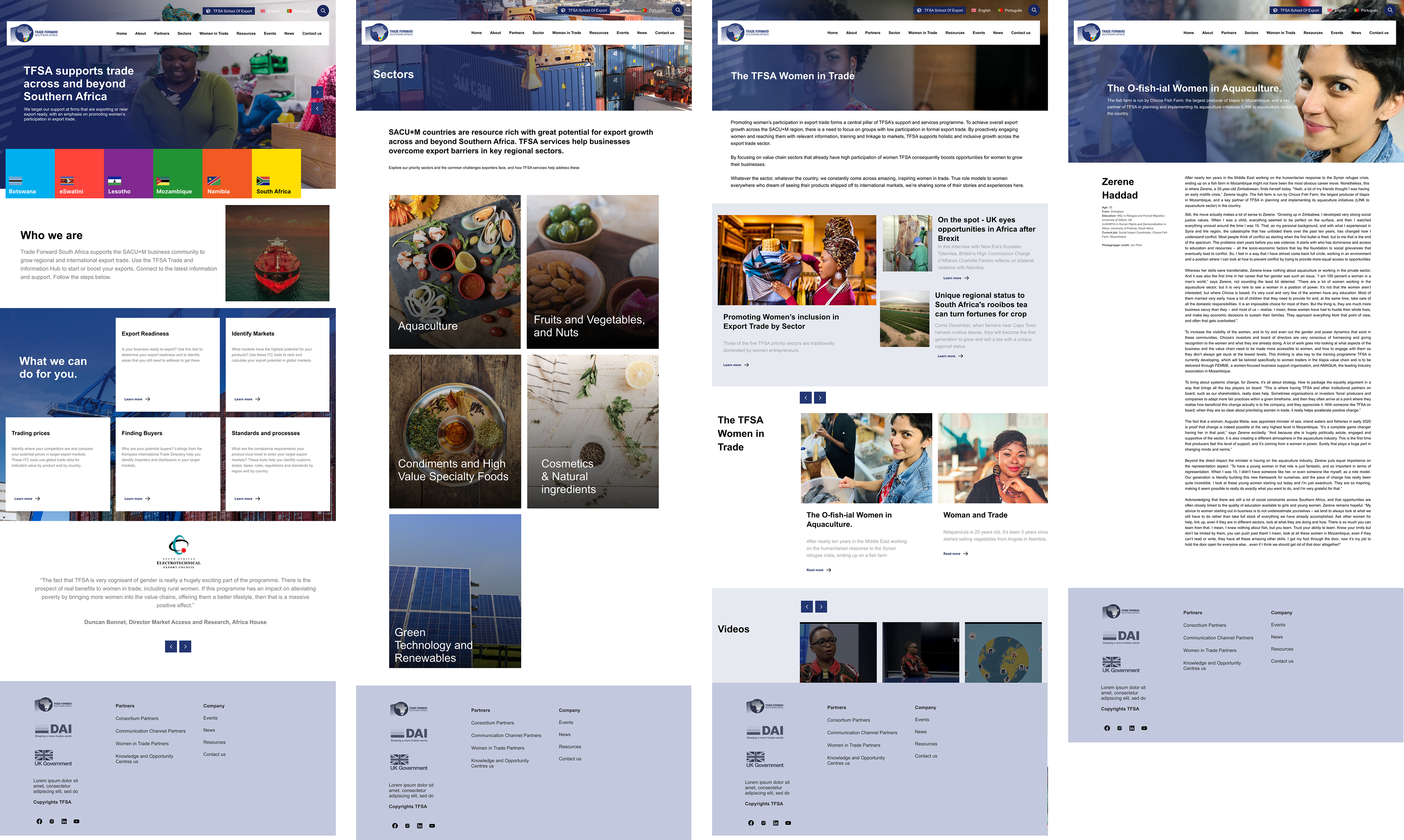
The TFSA website is a UK government-funded trade initiative supporting export growth through targeted solutions, including access to essential market information and tools to equip businesses to comply with standards and regulations across regional and global value chains, including in the UK. TFSA support and services focus on sectors with high participation in trade by women, and with significant production in rural areas, to promote inclusive economic growth.
The Problem
The TFSA required a clean, user-friendly website that would appeal to its audience and stakeholders. The requirement was for all users to access related to the industry and sector if they want to gain information.
The website had no affordance in the navigation making it difficult for the user to find information about Trading in the sector and its origin.
The website had repetitive content on other pages. The new content needed to be structured and organised for users to easily find what they looking for.
The website had no guidelines on content structuring and design and it was mostly cluttered and had no hierarchy.
The process
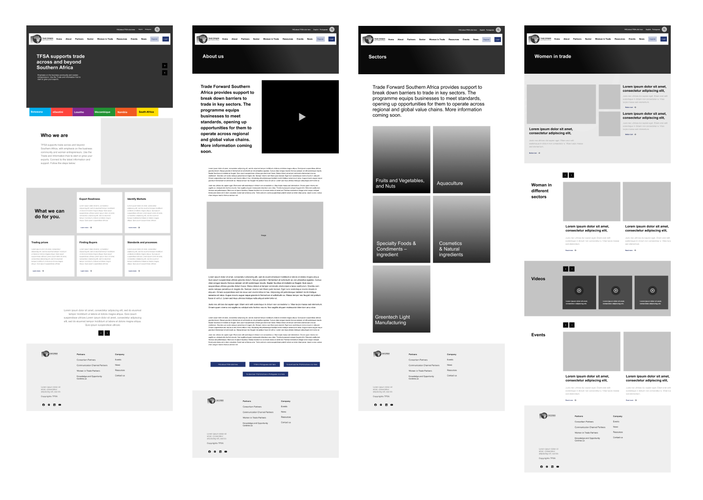
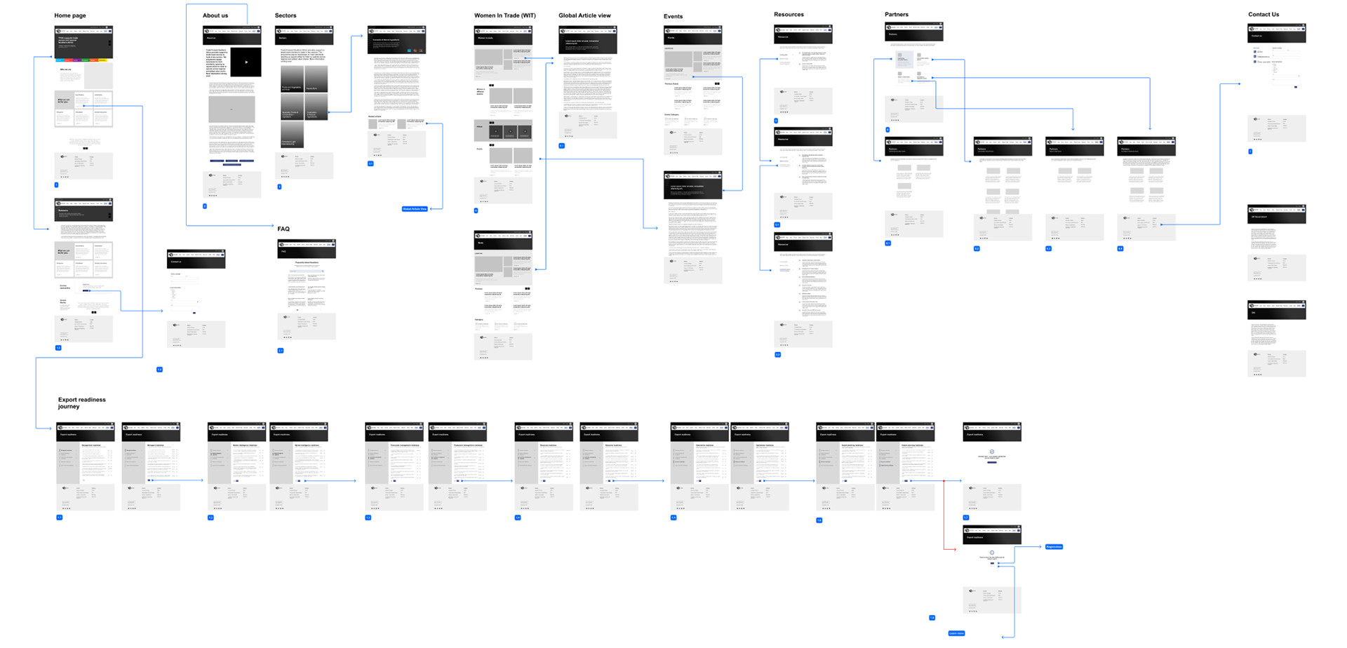
Wireframing and information architecture
From the client's brief, I designed wireframes for the TFSA website. This included a new section of the website and how the navigation would work. I design wireframes based on the content provided and ensured that the information architecture is easy for first-time users.
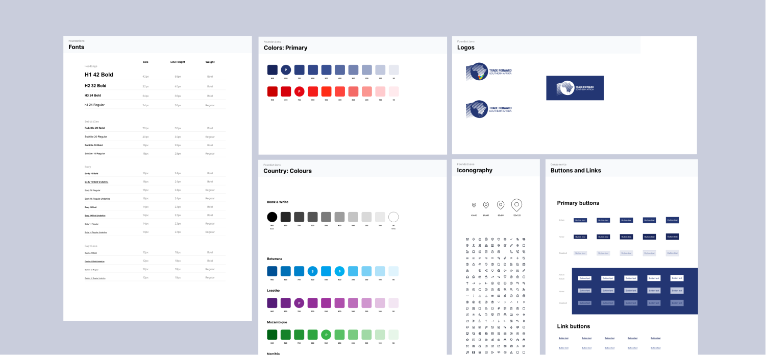
Designing a system for the developers for rapid development and scaling
With previous experience in use of design systems and seeing success with rapid prototyping and development. I suggested that we design a partial design system that will be developed for better consistency and allow the brand to use it for any future work on the website or mobile applications.
With previous experience in use of design systems and seeing success with rapid prototyping and development. I suggested that we design a partial design system that will be developed for better consistency and allow the brand to use it for any future work on the website or mobile applications.
Hi-fidelity designs
The results
We were able to achieve the following :
- Easy an to navigate website.
- Content structure and categorization
- Aesthetically appealing website
- Design system for consistency and easy designer-to-developer handover
- Easy an to navigate website.
- Content structure and categorization
- Aesthetically appealing website
- Design system for consistency and easy designer-to-developer handover
What I could have done better:
Create a central documentation solution that integrates with Figma to make it easy for the designer and developers to keep the design system tokens up to date.